索尼20个鼓舞人心的广告
灵感对于视觉设计师来说非常重要。你会有新的想法,你的风格会被塑造和影响,你会变得精力充沛,对你的视觉艺术越来越充满激情。那么,为什么不把索尼作为灵感的来源呢?索尼以时尚著称,这也转化为他们的许多广告。因此,为了获得一些甜美的设计灵感,本文特写了20个索尼的精彩广告
我们之前发表过一篇关于创造性的、有时有争议的Playstation广告的帖子,但本文将展示索尼的广告,这些广告看起来很棒,而不仅仅是创造性的,而且还跨越了索尼的许多产品线。
你可能还想看看我们收集的强大的公众意识印刷广告,美丽的印刷广告或创意乐高广告排版。
索尼的20个精彩广告
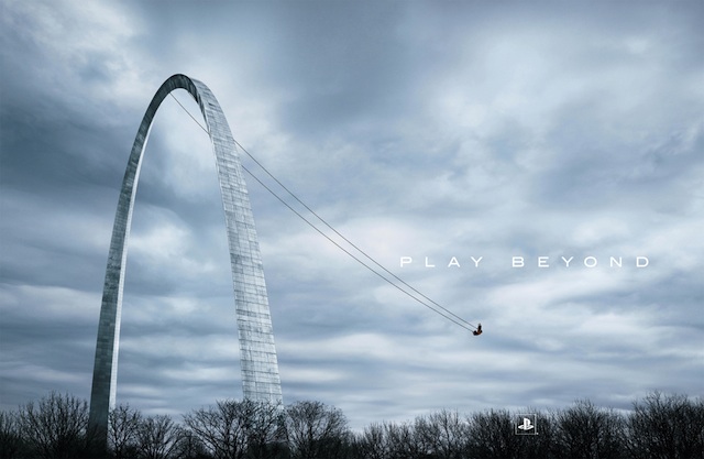
Clean, grand, and perfectly portraying the message of the Playstation. You can play beyond what’s normal in video games, and that’s shown here by playing beyond what a normal swing set is.

The opposite of the previous Playstation ad but still stylish, clean, and portraying the message of the Playstation. This time it’s on a micro rather than macro scale, showing how you can go beyond a normal rock, paper, scissors game.

The possibilities are endless with the Playstation 2 is what Sony was seemingly trying to say here. And it’s shown with a fun and bold showing of what’s inside a PS2 gamer’s head.

Your eyes will be blown away? Whatever the message, it doesn’t change the stylish, fun, and eye-grabbing (pun intended) ad for the Playstation 3.

Like with the previous eye ad, this Playstation 3 ad could possibly be saying that this new console has shed all the fat from previous generations of video games. Whatever the message, it’s another bold visual.
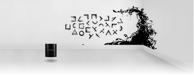
A cryptic Playstation 3 ad, all that’s known for certain is it looks really stylish and artful. Clean black-and-white design, effective use of a real space–in this case, a room–and the product that’s advertised shown in a non-intrusive way. In fact, the console is part of the design of this ad.

Clean, focused, funny, stylish, and conveys the message of the Sony micro storage being able to store the impossible.

Another clean, focused, funny, and stylish ad that conveys the message of the Sony micro storage being able to store the impossible.

One more clean, focused, funny, and stylish ad that conveys the message of the Sony micro storage being able to store the impossible.

A clean, focused, and stylish ad that is also clever in how it visualizes what the Micro storage product does. Meaning, in the shape of the actual physical product (a USB storage stick) Sony shows what it can store in a literal way: music, as a row of CDs.
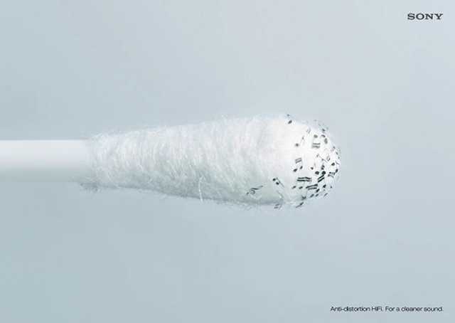
Sony just has a knack for using clean, focused, and stylish ads, huh? This one is no exception, and the cleverness comes from showing a literal way of how clean the audio signal is with Sony’s Hi Fi product. In this case, a q-tip cleaning stick with musical notes: clean audio.

There’s less sleekness here than with other Sony ads in this showcase, but this ad is still clean, stylish, and above all, fun. Follow your ears and choose these earphones, Sony says. And Sony shows it in a wonderland way by having your ears be butterfly wings, with the butterfly picking up the earphone “flower”.

Another ad that’s not as sleek as the others in this showcase, but it’s still stylish in a cinematic way and focused. In this one, the immersive quality of the home theatre product that Sony wants to convey is perfectly shown. A couple being so immersed in the movie that it’s as if they’re literally in the scene.
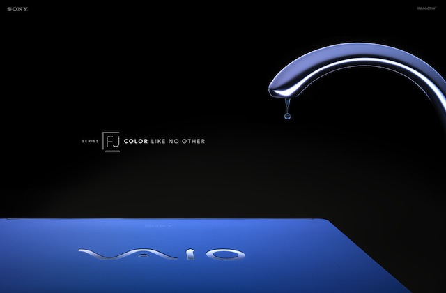
This makes the Vaio laptop look like a high-end fashion product or something – which is no doubt what Sony wanted. The focus (notice a pattern?) this time is on the nice colors of the Vaio laptop line, in this case blue.

Like the previous ad, this makes the Vaio laptop look like a high-end fashion product or something. Instead of blue the color this time is red. However, unlike the previous ad, a bit of a concept is added: the red fine wine is “spilled” onto the table in the form of the laptop.
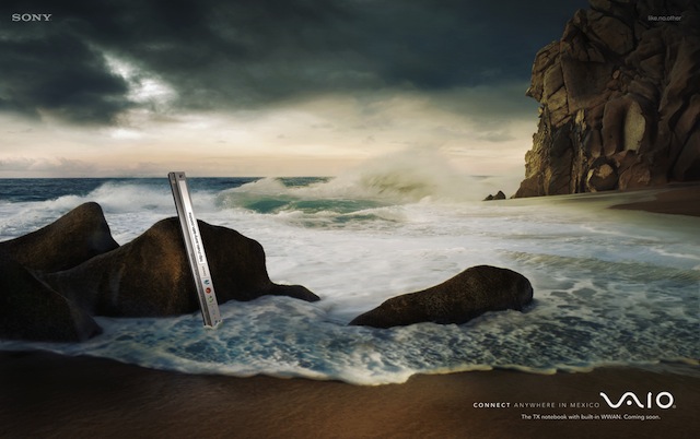
You can’t go wrong with a breathtaking shot of nature. What’s interesting is how Sony was actually able to incorporate what they’re advertising so naturally into the shot: connectivity anywhere via the Vaio laptop. The web browser bar is part of the scenery.

Just like the previous Vaio connect-anywhere ad, but a breathtaking and dramatic shot of a lake instead of a beach. And the web browser bar is part of the scenery.
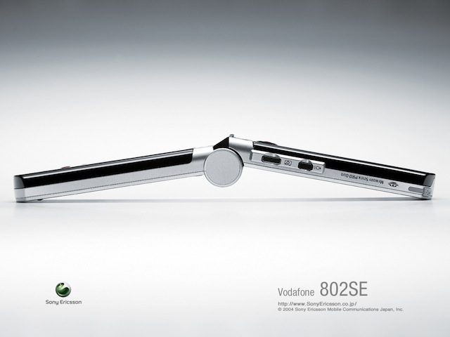
Sometimes you want to go back to the basics. No clever concept, no artful interpretation of what the product does, just an incredibly stylish, sleek, and high-end fashion-like shot of a product – in this case, a cell phone.

The opposite of the previous Sony Ericsson cell phone ad: a clever concept and an artful interpretation of what the product does. The music on this phone is of such high quality that it’s like listening in a studio is what Sony’s apparently trying to convey. It does that cleverly by showing the entire environment of the jogger on the go as if it were a padded studio.

Another example of a clever and artful Sony Ericsson cell phone ad. The high quality music on the phone is like listening in a studio is Sony’s message. That’s cleverly shown by having the entire environment of the biker on the go as if it were a padded studio.
你最喜欢的索尼广告
轮到你了:你最喜欢的索尼广告中有哪些没有出现在这个列表中?请在下面的评论部分自由分享您最喜欢的内容。
来源:https://speckyboy.com/20-awesome-inspiring-ads-from-sony/

